I love watches and technology, so I was thrilled to hear about the creation of a “horological smart watch” base by the Swiss watchmaking industry. One of the first examples of this new breed is the just-released Mondaine Helvetica Smart. I purchased one of these watches, the limited-edition “1 of 1957” variety, and have had a chance to evaluate it both as a watch and a gadget.

Since this is my watch blog, this review focuses mainly on the core question: As a watch, how good is this new Mondaine watch? If you’re interested in reading about it as a gadget in detail, I recommend that you head over to Pack Rat and read my post there, How Smart Is the Mondaine Helvetica Smart Watch?
A Swiss Smart Watch
Technology-wise, the Mondaine Helvetica Smart Watch packs the new activity monitor movement from MMT, a consortium set up by Peter Stas of Frederique Constant/Alpina and Philippe Kahn of Fullpower and MotionX. It’s essentially a combination of a Fitbit-type activity band and simple stepper motor-driven analog watch movement. On the dial, only the addition of a sub-dial hand to show activity progress marks the electronics inside.
Overall, it’s a very subtle smart watch, and much less flashy/garish than the TAG Heuer Carrera Connected with its glowing Android Wear display. It doesn’t do much, but that’s welcome in a field of blinking and beeping gadgets!
Overview of the Helvetica Smart
To a watch guy, the design and construction of the Mondaine Helvetica is more important than the activity monitor technology that lurks inside. Since this is a contemporary watch, some buyers will be turned off immediately. It features flat, plasticky hands and a modern, angular case and is dimensioned on the large side at 44 mm. But it’s the button that takes the place of a crown that is most noticeable and jarring. Nothing else looks like it.
Let’s start with the case. Mondaine is best-known for their Official Swiss Railways (SBB) line of watches and clocks, though the company has existed for decades. With headquarters in Zurich and a factory in Solothurn, the company is just as Swiss as their SBB watch line would have us believe.
In 2014, Mondaine introduced a second Switzerland-inspired watch line, the Helvetica No. 1. The lugs reflect that legendary font face, named for and inspired by the Swiss homeland. Although curved out of true, it is easy to spot the Helvetica numeral “1” on each side of the face. Appropriately for such a clean font, the rest of the case includes trim and sharp lines and angles that emphasize the key components: Bezel, body, lugs, back.
Dial, Sub-Dial, and Hands
The dial continues this clean look, with Arabic numerals at 3, 6, and 12 (in Helvetica, appropriately) and a few lines of text. All of this is done in a tidy gray on the limited-edition Helvetica Smart “1 of 1957” that I purchased, though other models have different colors. Stark rectangles mark the remaining hours, and these are raised, along with un-colored squares on the minutes.
The sub-dial is crisp (but not bright), showing the date and activity progress white with red and black hands and markings. Interestingly, Frederique Constant chose to use the contrasting color and markings for the date, not the activity indicator, and has that on the smaller, inner hand as well. I prefer the Mondaine approach, since it shows the time and date functions in black and added “smart” complication in red.
One thing I do not like, design-wise, was the choice to left-align the “12” and dial markings with the centerline of the watch. It throws off the classic 12-centric symmetry of the watch face, making noon appear to be rotated one minute clockwise. This same trick is repeated for the date with the “31” and in reverse for the “16”. But the left anchor is retained for the activity sub-dial, with both the “100” (percent) and “50” aligned like the “12”. Back to the date scale, there are two “ticks” missing between 31 and 1, making space for a moon (sleep mode) indicator and jarring blank spot. And that “1” is done in red instead of the black used by every other time-and-date function on the face! On the whole, the dial is acceptable but the sub-dial is just bizarre.
The hands are flat plastic-looking affairs, no doubt chosen for their power-saving light weight. They match the hour markers and go well enough with the overall modern look of the watch, but they’re really nothing special to look at. These hands are simply functional. This is a disappointment since so many other Swiss and Japanese watches feature hands that draw the wearer in.
Bezel, Case, and Crown
The stainless steel case and bezel are finished with crisp but not especially sharp lines. One gets the sense that they are machine-finished rather than hand-done as on luxury Swiss watches. And I noted a few imperfections in the brushed stainless here and there. It gives the impression of being a fine, but not luxurious watch, only barely matching the finish of low-end products from contemporary competitors like Tissot and Hamilton.
The “crown” is actually a button, used to enable Bluetooth synchronization with an app running on a smart phone. Other MMT watches have a crown-style button, but Mondaine goes with form-follows-function with a solid, clear button. It’s styled like a science fiction movie prop rather than even a chronograph pusher. It “sticks out” both literally and design-wise. And Mondaine continues with the theme by adding a Swiss cross on the button.
The watch bezel is a clean affair, with a flat top and angular sides that remind me of a Grand Seiko more than anything out of Switzerland. It surround a flat sapphire crystal that is quite susceptible to glare but continues the clean look.
The case juts out at an angle by a few millimeters before tapering back towards the wrist. Combined with the bezel, this creates a “stacked plates” appearance that is interesting to see. The case back is a curving affair that continues the taper in the extreme. It’s held on with four screws (at the lugs) and surrounds a metal plate with circumferential cutouts, presumably to allow the “coaching” beeps to escape.

That case back disc is engraved with quite a bit of text, again left-aligned along the center line. Interestingly, the face proclaims this the “Mondaine Helvetica Smart”, while the case adds “No1 Bold MH1.B2”, suggesting that this is the same case as the limited-edition Helvetica No. 1.
The side of the case is engraved “1 of 1957”, which initially piqued my interest: Since most limited-edition luxury watches are engraved with their exact number in the series, had I really received “number 1”? But alas, all 1,957 in this series are engraved “1 of 1957”.
Strap and Buckle
Where the dial, case, bezel, and button are starkly contemporary, the strap and buckle are anything but. The simple but solid leather strap is straight from the Mondaine parts bin, as is the sculpted brushed stainless buckle. The matte black leather shell is stitched to a brown lining. Both strap and buckle are hallmarked “Mondaine”.
I would have preferred a more modern strap: Perhaps a flat shell cordovan piece like the ones Nomos loves so much. And the buckle is really out of place, having no “Helvetica” influence whatsoever. It’s really all wrong for this watch.
Packaging and Experience
Mondaine’s packaging is downright disappointing. A simple folded cardboard outer box contains a just-big-enough cardboard inner box with a velveteen watch compartment. It’s quite lightweight and really feels cheap compared to Swiss competitors. I don’t expect a wood and inlay box like Swiss luxury watches, but this just isn’t up to snuff.

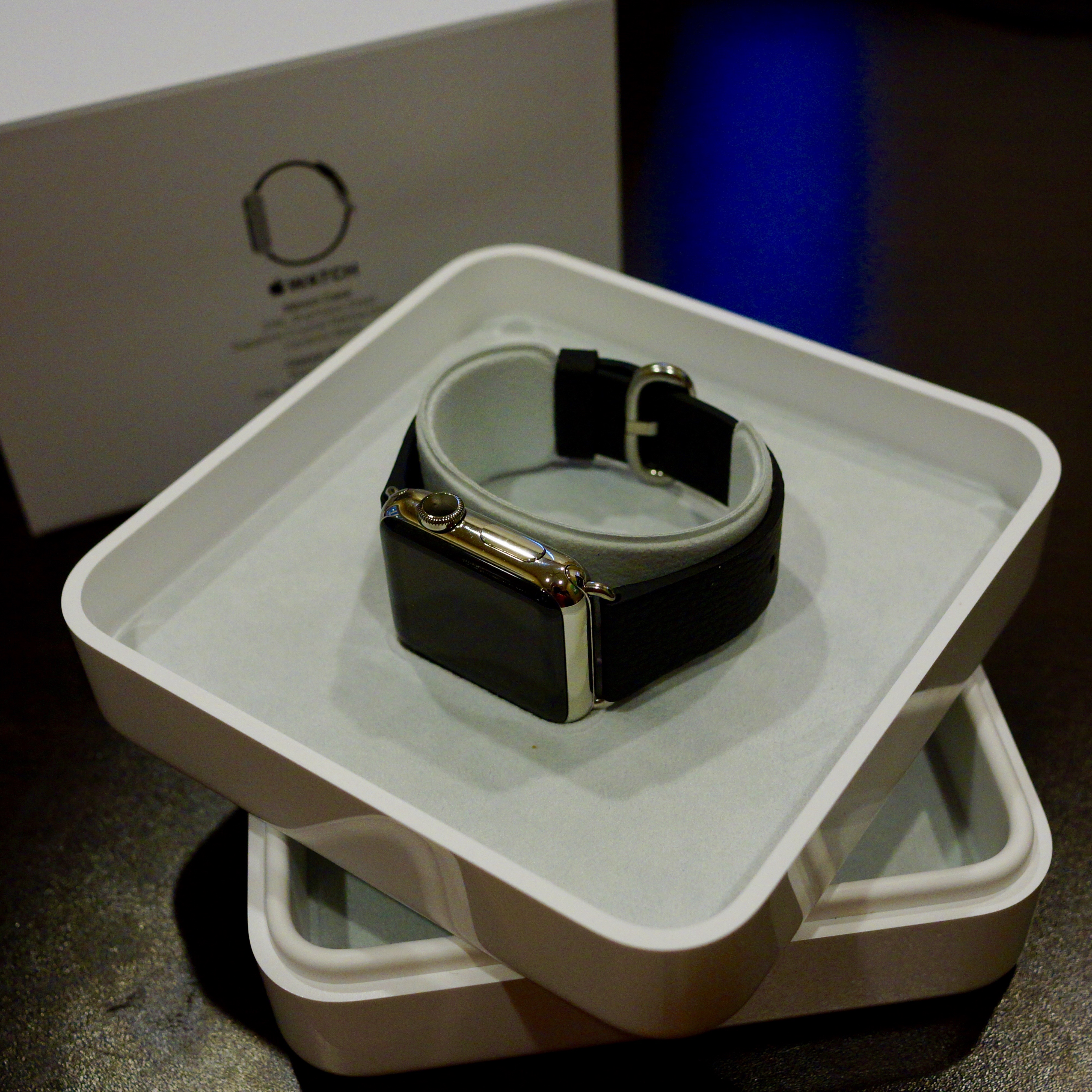
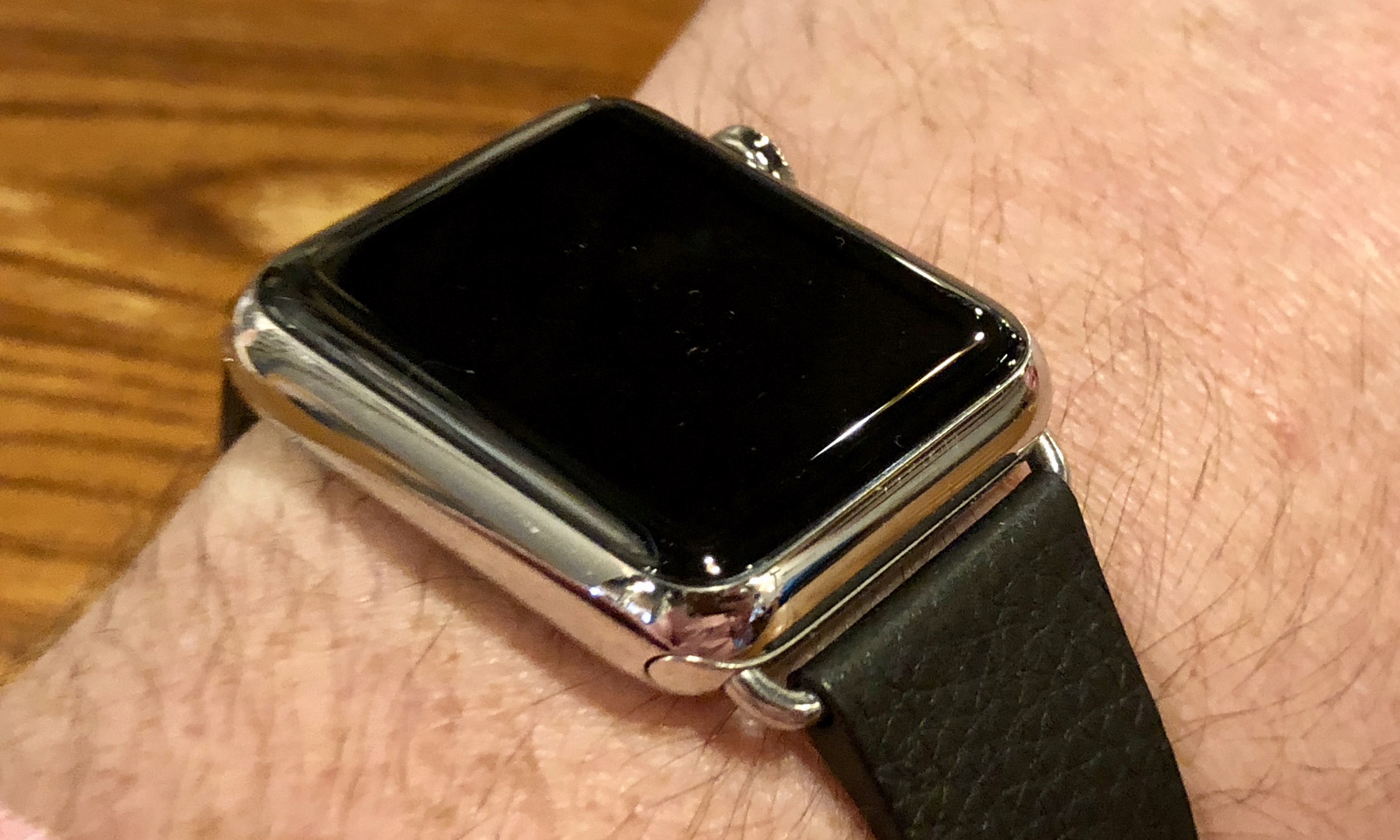
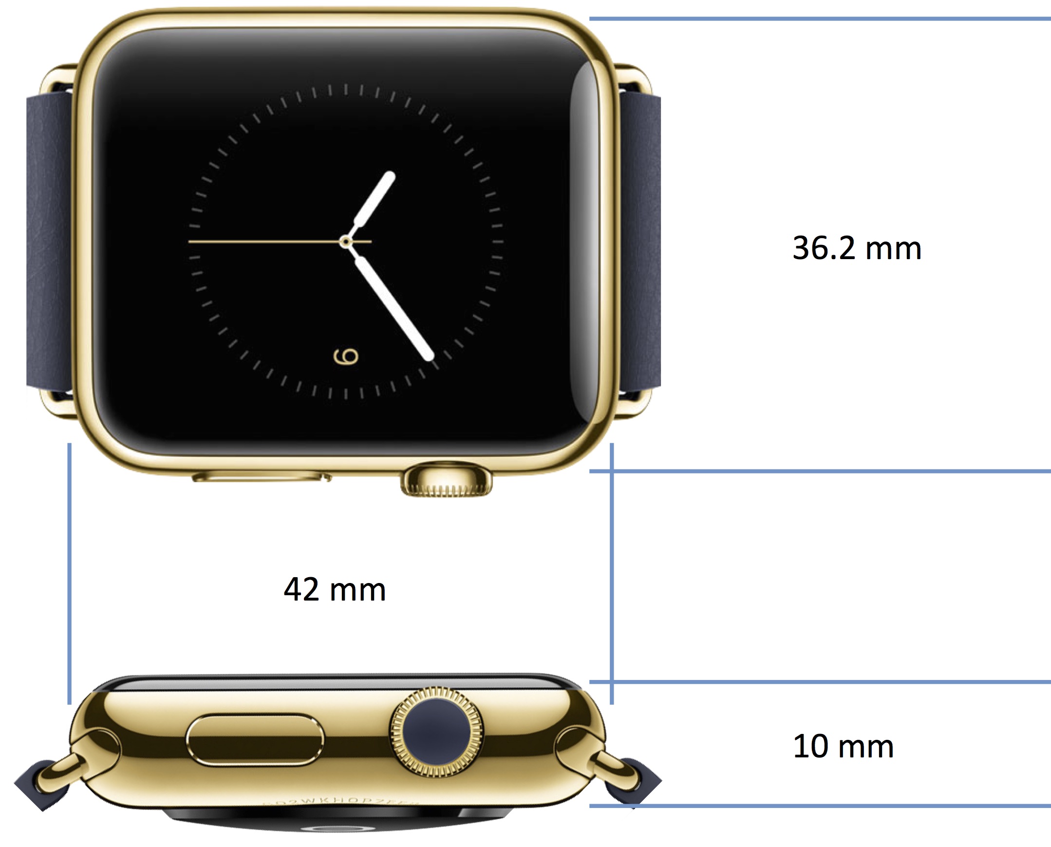
Apple created three plastic boxes for their Watch, ever-more fancy and heavy as one moves from aluminum “Sport” to steel to gold “Edition”. But even cardboard-cased Apple products use heavy, sharp packaging. In a comparison, an Apple buyer would surely be taken aback by the chintzy Mondaine materials.
The Grail Watch Judgment
Overall, the Mondaine Helvetica Smart watch falls short of the high bar set by Swiss competitors and Apple alike. In my review, I was surprised by the high-quality materials and finish evident in my steel Apple Watch. The reverse is true with the Mondaine; it’s just “good enough”. Combined with lackluster “smart watch” functionality, I’d call this a “do not buy”.

Year
Country
Brand
Style
Material
Movement
[…] Since this is my gadget blog, this review focuses mainly on the core question: As a gadget, how smart is this new “Smart” watch? If you’re interested in reading about it as a watch in detail, I recommend that you head over to Grail Watch and read my post there, How Good Is the Mondaine Helvetica Smart Watch? […]